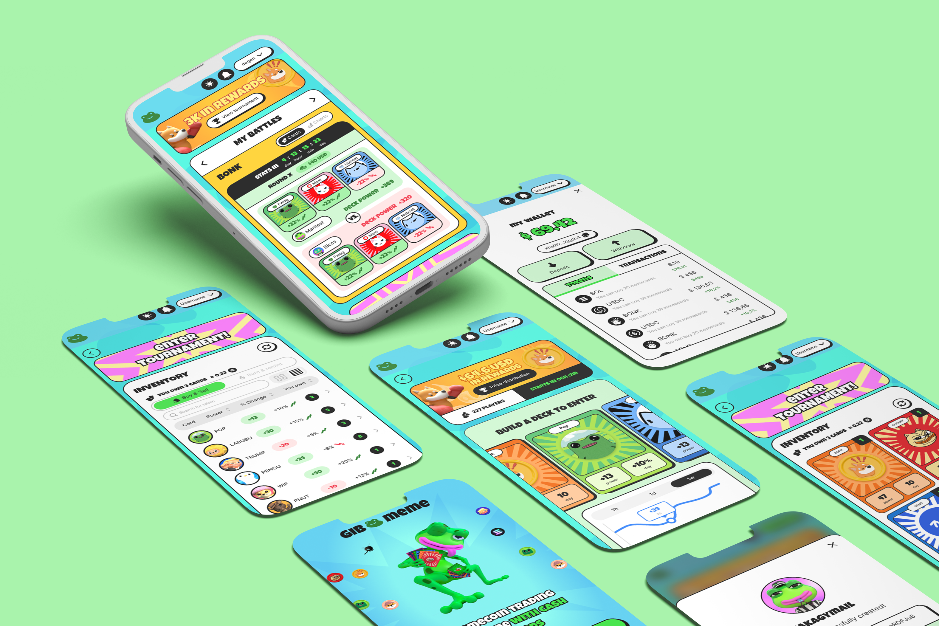
Gib.meme
How I built the visual identity and UI system for a blockchain card game, balancing meme culture with functional clarity in a fast‑paced development environment.
My Role
Product & Brand Designer. Owned the game's visual identity and end-to-end product execution, from research to handoff.
- UI/UX Design
- Visual identity & art direction
- Initial Design System & visual QA
- UX Research (usability tests + Hotjar)
- Assets AI Generation
Team Involved
- 1 Product Manager
- 1 Product Designer
- 2 Software Engineers
Duration
12 months · 2025
Industry
Web3 · Gaming (B2C)
Platform
Web app · Mobile & Desktop
The Impact
I structured the interface, the visual identity and the Design System that took the game live in late 2025, resolving the product's core conflict: serving the casual player and the investor player on the same screen.
Highlights
- Architecture & Flows (UX): Restructured the main navigation and the hybrid login to make complex Web3 journeys accessible to casual players.
- Interface Design (UI): High-fidelity prototyping for mobile and desktop, cutting cognitive load in user transactions.
- Design System & visual QA: Dynamic components and variants, with light and dark theme support, and implementation review to ensure fidelity to the design.
- Visual Identity & Art Direction: Created the game's visual identity and art-directed its assets, from concept to application.
Organizational Context
- Product Strategy: defined top-down by leadership: a Solana collectible card game built on meme culture, prioritizing a fast launch.
- Discovery & UX Research: deep discovery gave way to shipping speed; the team and I ran usability tests, and I grounded decisions in real behavior via Hotjar.
- Metrics: limited access to structured product metrics, requiring a focus on execution.
- Processes: remote startup running short cycles and partial deliveries across 12 months.
The real challenge wasn't speed, it was designing one interface for two opposing audiences: casual players who want fun without friction, and investor players who demand data and precision.
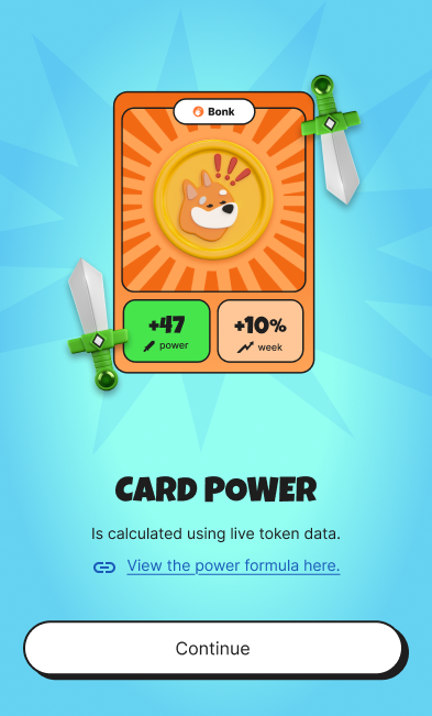
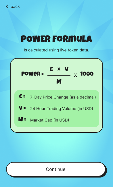
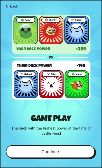
Each card represented a memecoin and carried a variable power tied to that coin's market value, and battles were fought between decks combining multiple cards. With the business strategy and user profiles already defined in a top-down format, my core problem to solve was strictly one of visual and interface execution: how to balance conflicting aesthetics and technical needs within a single platform?
The system had to accommodate two opposing realities simultaneously:
- The Casual Player, who seeks fun, dopamine, a vibrant visual style, and needs to be shielded from any technical friction, such as crypto jargon or complex wallet setups.
- The Investor Player, who demands clear on-screen data, efficient architecture, zero distractions, and speed for signing transactions and optimizing returns.
An experience that feels like a lighthearted, addictive game on the surface but operates with the precision, clarity, and systematic design of a financial product underneath.
To resolve the friction imposed by the brief, I structured the interface in two layers:
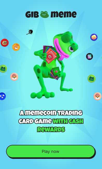
The Immersive Layer: Focused on attracting the casual player. I built a vibrant visual identity and guided the game's assets and animated interactions (GIFs). I generated assets with AI (Gemini and image platforms) that served as the base for 3D development, without losing the game's tactile, nostalgic feel.
The Functional Layer: Focused on conversion and trust. I shielded every transactional moment, such as connecting a wallet, purchasing packs and analyzing cards, from visual "chaos", with a clean interface anchored by a Design System and consistent grids that removed the player's doubt at every action, so the underlying blockchain complexity stayed invisible.
Persona 1: The Casual Player
Attracted by meme culture and the promise of "playing to win." Doesn't understand (and doesn't want to understand) the complexity behind the blockchain.
"I just want to open my packs, laugh with the cards, and try to win the tournament."
What they want
- To get into the game as quickly as possible (short time-to-value).
- To collect cards for the art and the fun.
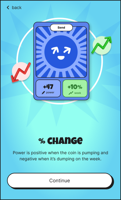
- To understand the rules and the strength of their deck in a purely visual way.
Pains / Frustrations
- Feels intimidated by crypto jargon (Gas fees, Seed phrases, Signatures).
- Doesn't have a wallet installed and abandons the flow if forced to create one.
- Fear of making an irreversible mistake and losing real money.
How the UX addressed this persona
- Invisible login (via email/Privy).
- Unboxing animations focused on dopamine and nostalgia.
- Inventory view based on a visual format (Visual Cards).
Persona 2: The Investor Player
Crypto-native, focused on return on investment (ROI) and efficiency. In the game to farm airdrops (like Cherry), accumulate tokens on Solana, and climb the leaderboards.
"I need clear and fast data to optimize my deck, make quick transactions, and maximize my gains."
What they want
- Connect his wallet (e.g., Phantom) with one click.
- Buy multiple card packs efficiently.
- Monitor the power/value fluctuations of cards in real time according to the market.
Pains / Frustrations
- Slow interfaces or interfaces with too many animations that delay transaction signing.
- Excessively "childish" design that hides the raw data and statistics necessary for decision-making.
How the UX addressed this persona
- Direct wallet connection flow.
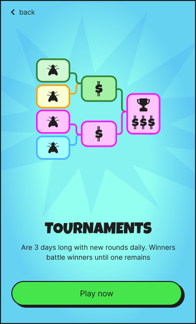
- Scalable information architecture with quick access to "Map" and "Tournaments".
- Data-driven inventory view, allowing dynamic reading of attributes for deck optimization.
In a top-down, speed-first startup, I became the advocate for craft, protecting visual quality and consistency where formal UX processes couldn't fit.
Structured UX processes, like deep discovery, take a back seat when shipping is the priority. In this top-down scenario, my role evolved into being the primary advocate for visual quality and consistency. I focused my energy on what I could control: ensuring flawless art direction, building an initial, strategic Design System for developers, running visual QA on the front-end implementation to guarantee fidelity to the design, and applying usability heuristics to mitigate friction before launch.
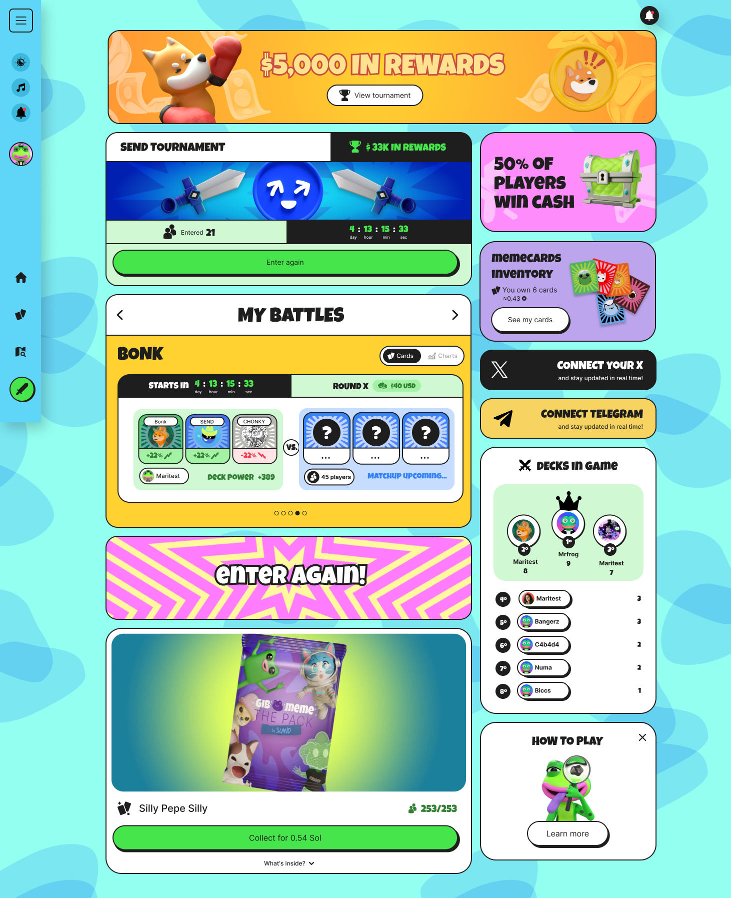
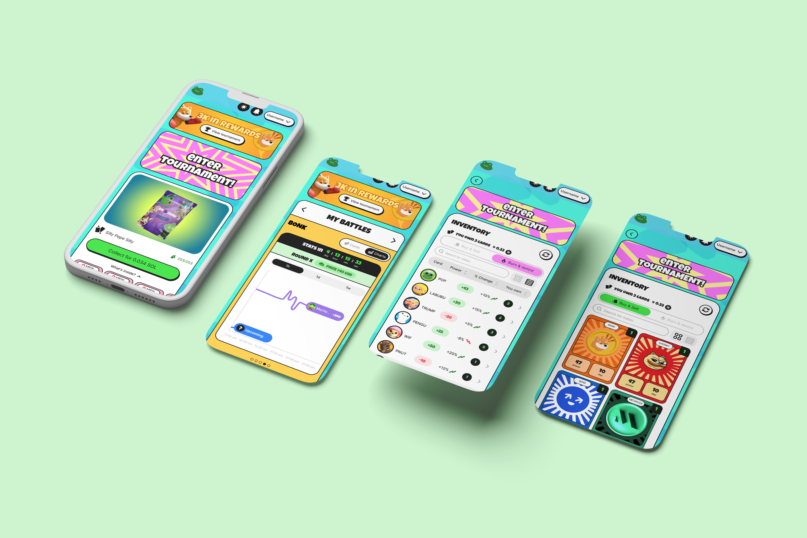
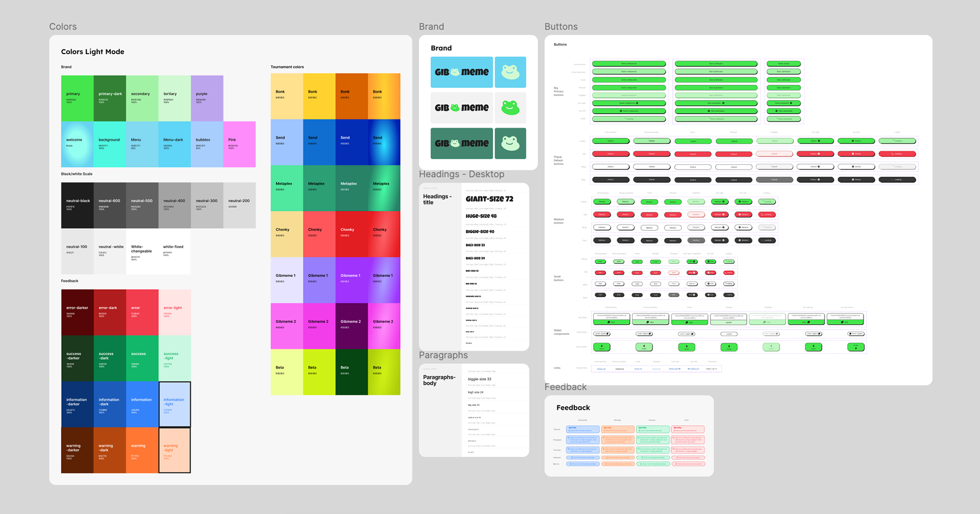
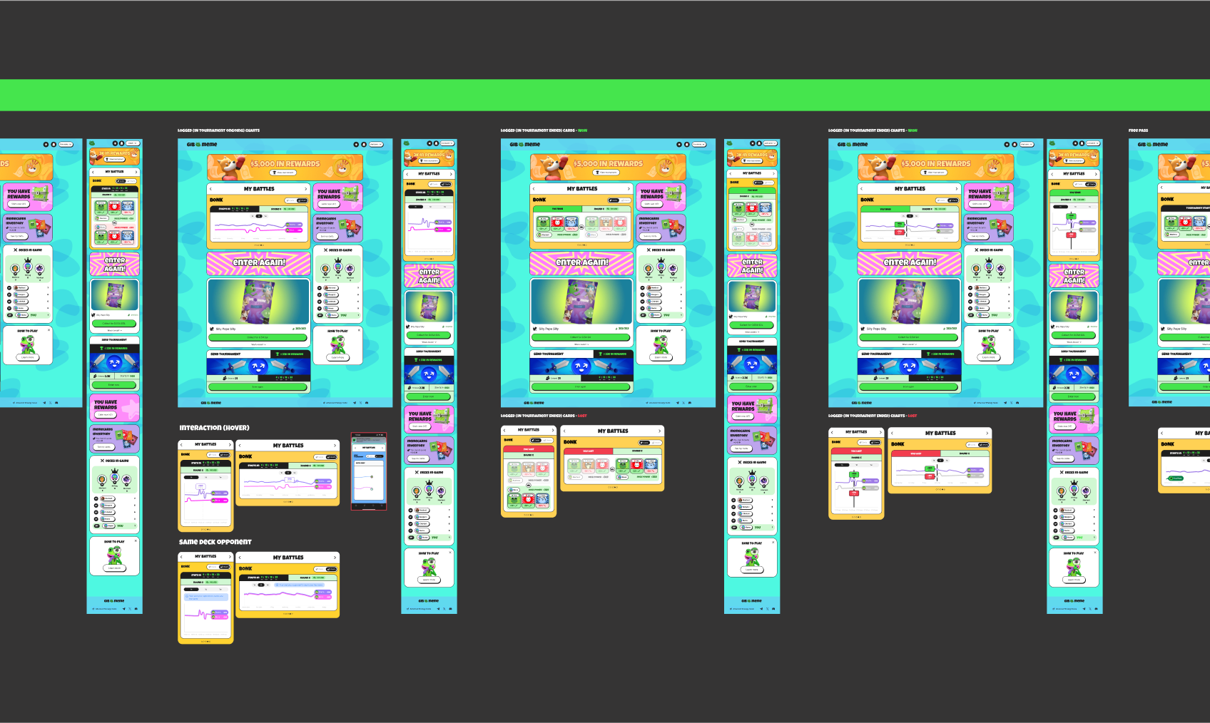
Beyond the product, I built the game's visual identity. The game had to be colorful, chaotic and fun like meme culture itself, so I built a vibrant palette that embraced that excess. The variation became a system of its own: each new round had a different memecoin theme with its own identity, and that shift lived in the round's invitation banners, while the transactional interface stayed stable.
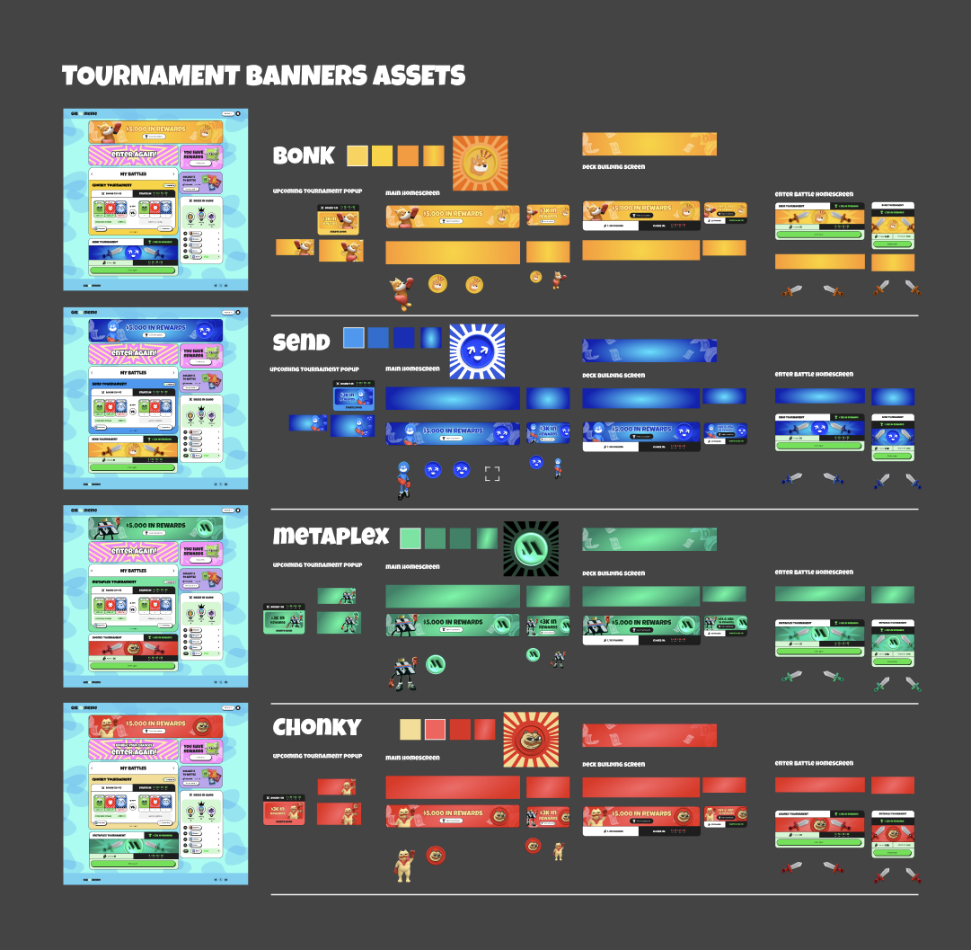
Round invitation banners: each new round brought a different memecoin, with its own theme and identity.
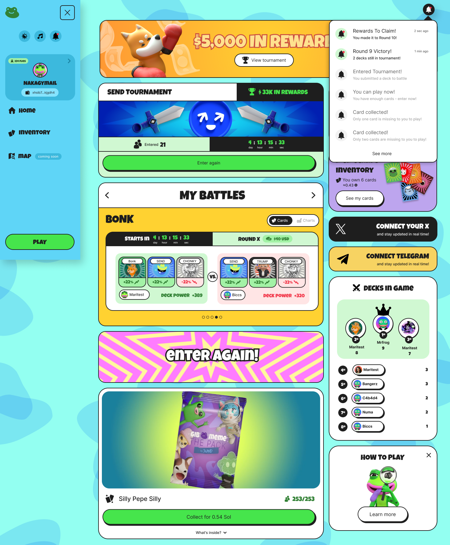
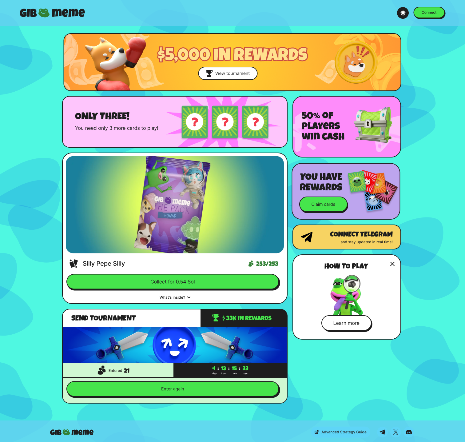
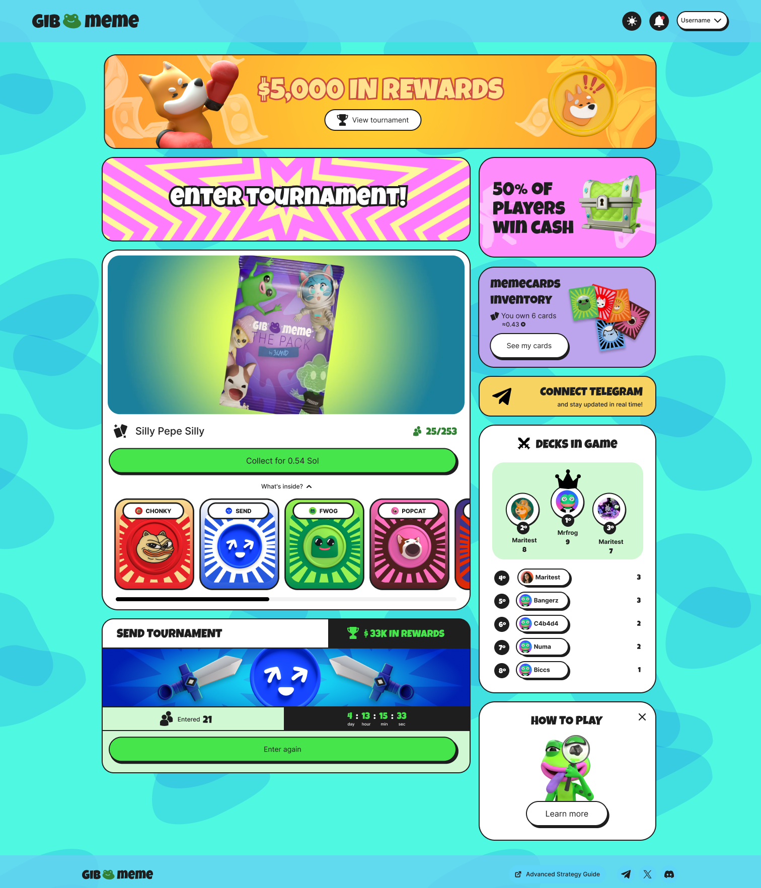
With limited metrics, I used Hotjar recordings to justify a structural pivot, from a top menu to a scalable sidebar, as new features kept shipping.
While access to structured product metrics was limited, I sought to ground critical architectural decisions in qualitative data. By analyzing available Hotjar session recordings, I identified a usability bottleneck: as new features were rapidly introduced, the original top menu hindered feature discovery and engagement. The solution was a structural pivot to a sidebar navigation, resolving the immediate friction and ensuring continuous scalability for the product.
The new sidebar navigation, in both of the game's themes.
I turned unavoidable blockchain wait times into a reward: an "unboxing" animation that replaces dead loading screens with a hit of dopamine.
Blockchain processing often results in frustrating wait times. Instead of relying on generic "loading" or "success" screens, I leveraged the art direction to enhance usability. I proposed an "unboxing" animation to transform the technical delay imposed by Web3 into a moment of visual reward, triggering dopamine and active engagement.
Buying and opening a pack: revealing the cards turns transaction processing time into a reward.
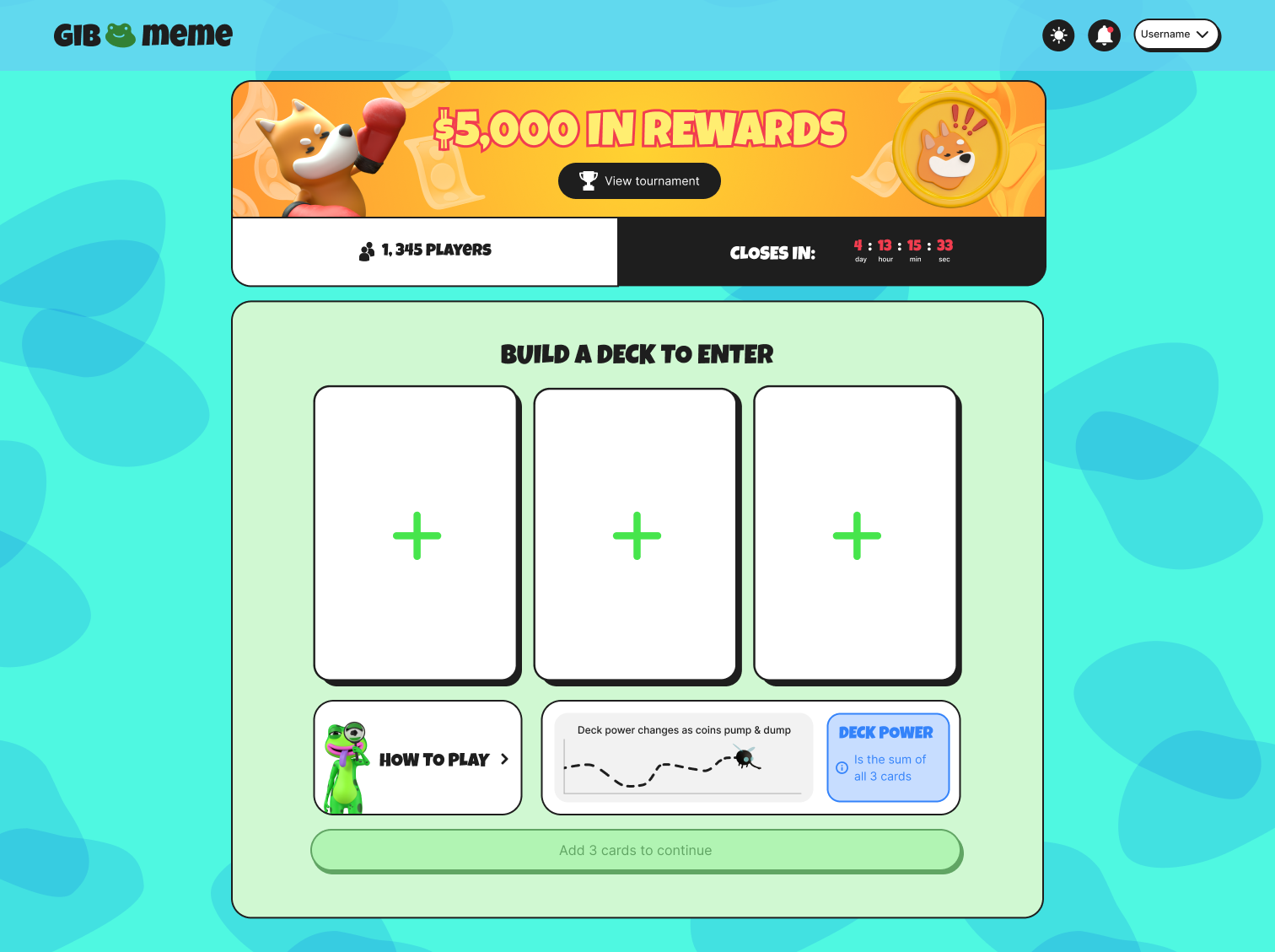
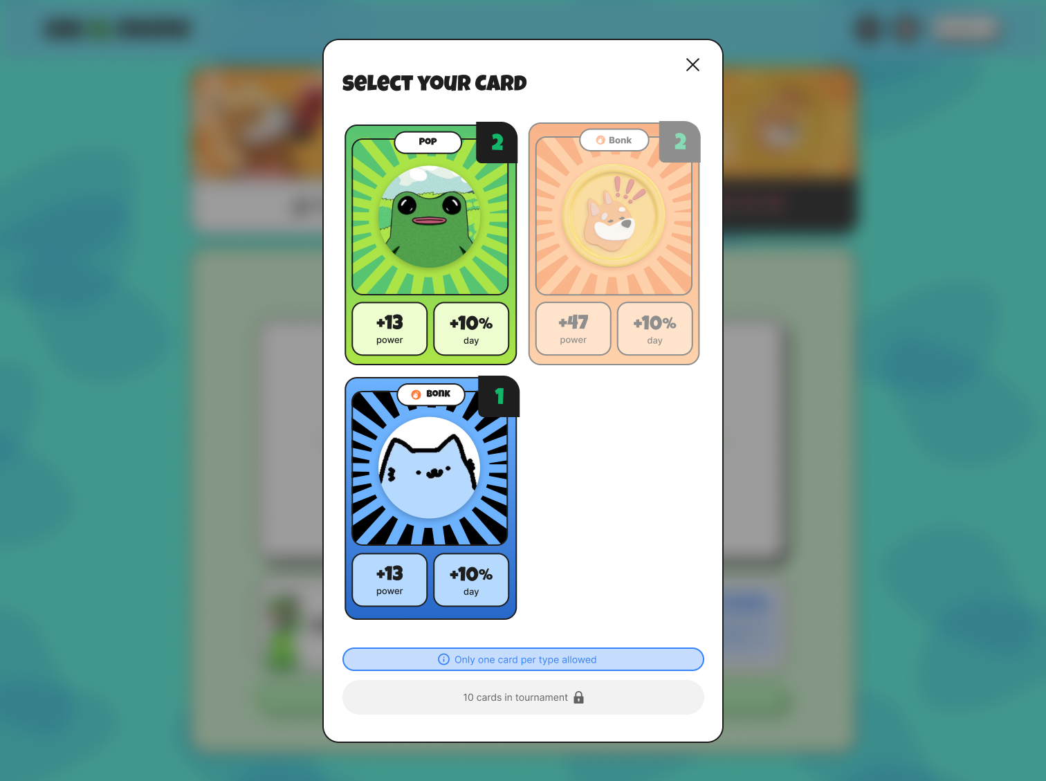
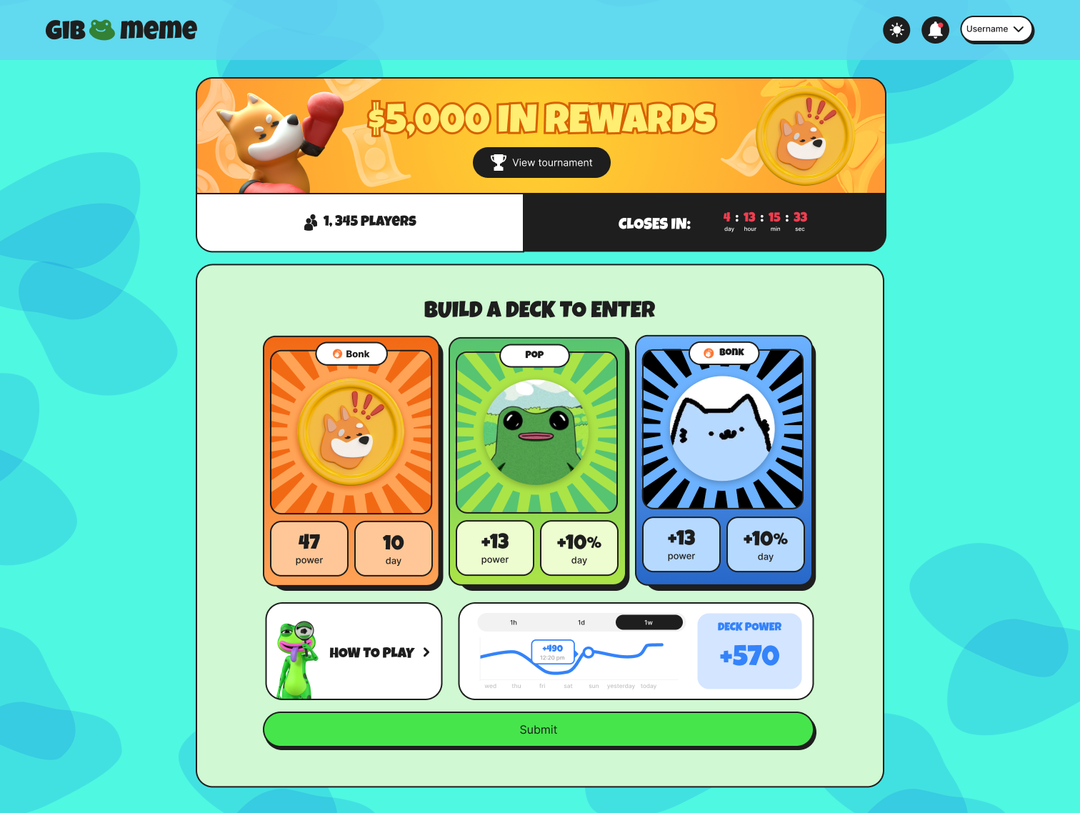
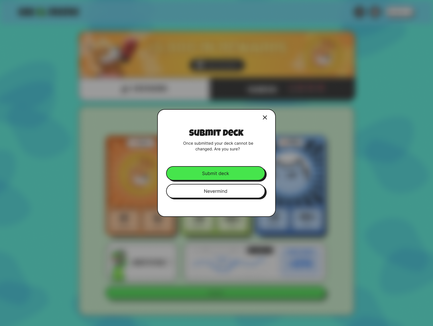
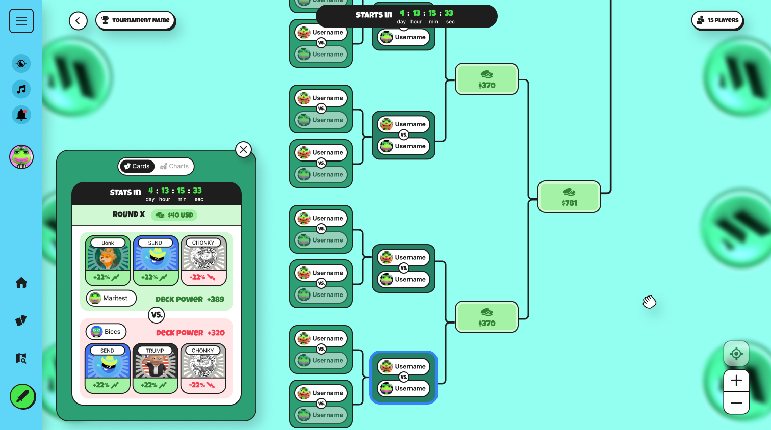
The player selects cards, reviews the deck and submits it to enter a match. Each step had to make the deck's power legible without requiring the player to read market data.
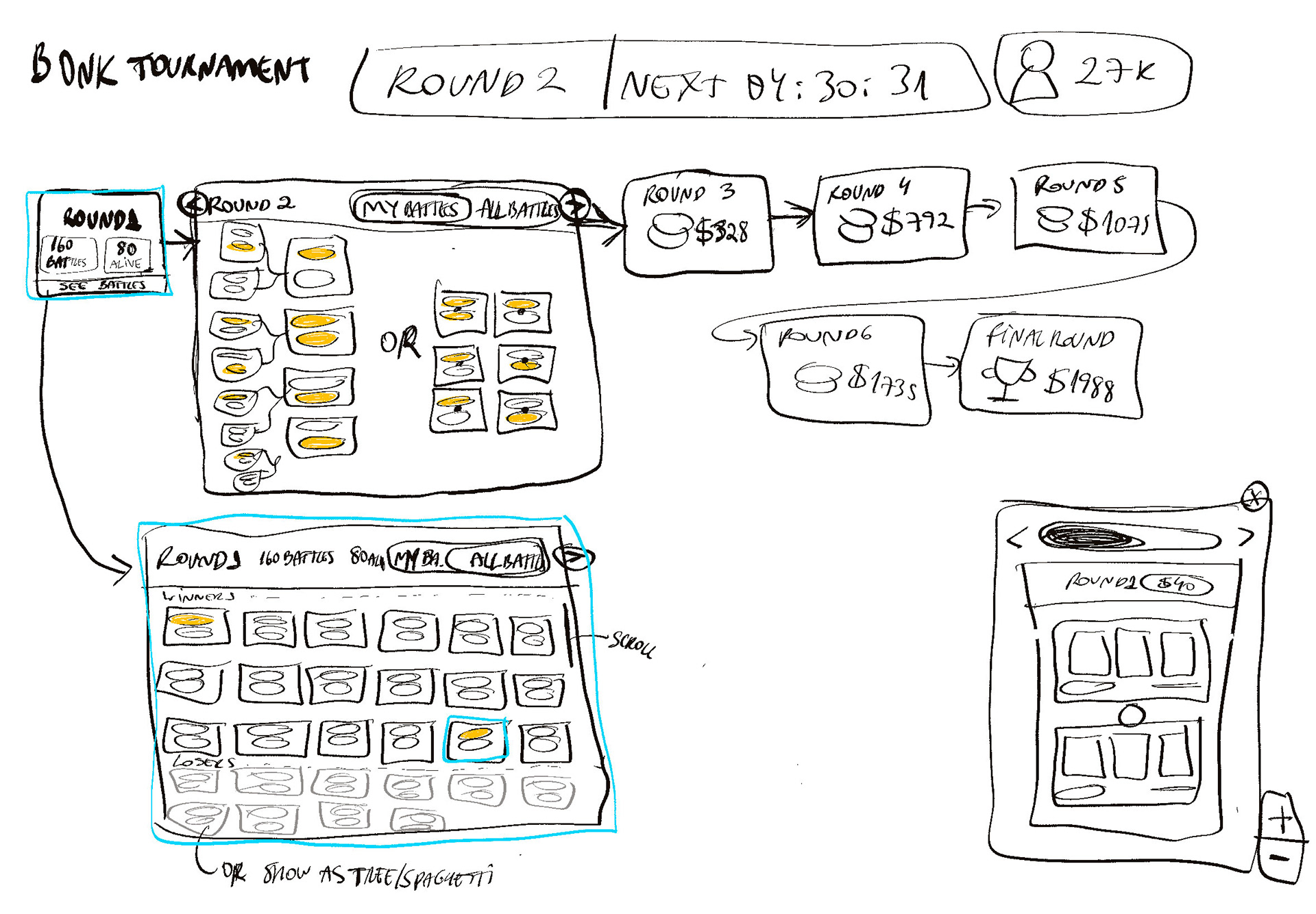
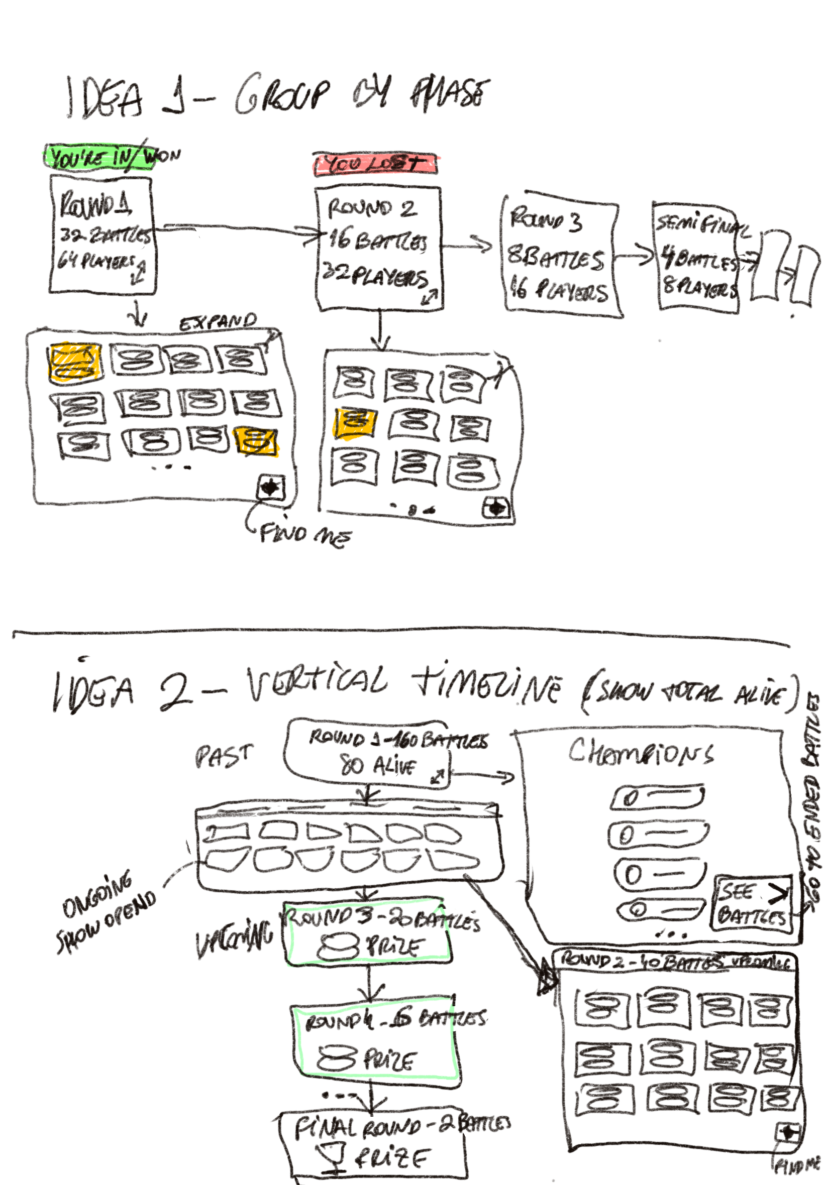
The map had to show rounds, opponents and results on a single screen without turning into a data dashboard. The wireframe studies below tested how to distribute that information before arriving at the final version.
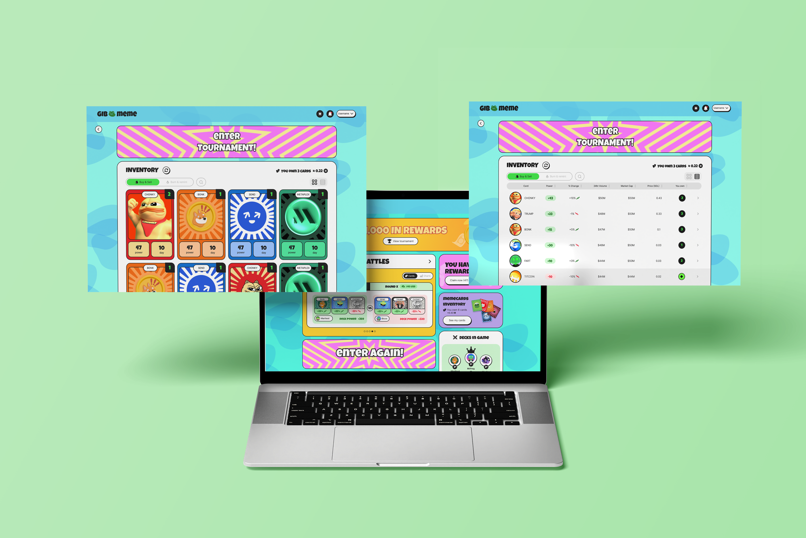
One inventory, two modes: Visual Cards for players who love the art, and a Data List for investors who need to compare numbers fast.
Because card attributes fluctuate in real-time with the crypto market, the interface needed to accommodate vastly different use cases. My UI solution was to design two distinct viewing modes (Visual Cards vs. Data List). This decision directly solved the interface conflict: it serves the casual player focused on art, and the analytical investor who needs to compare numbers quickly, effectively reducing cognitive load for both.
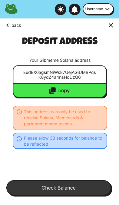
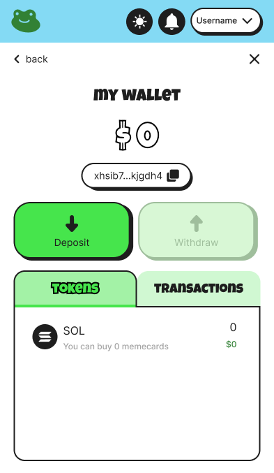
One onboarding for two worlds: wallet connection for Web3 natives, email login for everyone else, with blockchain complexity kept out of sight.
The technical requirement involved integrating Privy to support dual login methods. My role was to translate this visually: I designed a frictionless flow where Web3 natives can seamlessly connect their wallets, while casual users log in with just an email. The UI was intentionally crafted to hide blockchain complexity, ensuring an approachable entry for any user profile.
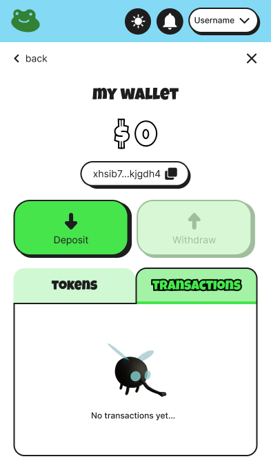
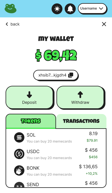
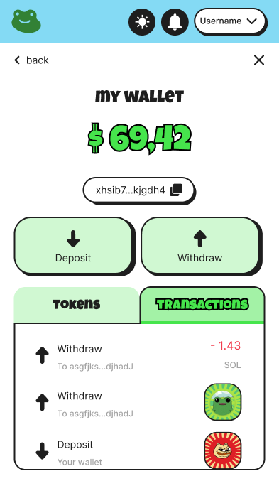
The game launched in late 2025 and is still live, evolving beyond the MVP I structured, with rounds of over 3,000 players. Given the restricted scope, this project's impact is measured by the strategic and technical execution that made that launch possible:
- Enabling the MVP (Zero to One): I delivered the interface and visual identity required to bring the product to life, turning an abstract brief into a functional, visually engaging digital product.
- Engineering Acceleration: Building a consistent Design System from reusable components drastically reduced handoff friction. This allowed the engineering team to scale screen development autonomously and predictably.
- Translating Web3 Complexity: I successfully shielded casual players from the financial anxiety typical of crypto platforms. The transactional flows (pack purchases, hybrid login) convey trust through a clean UI, without losing the fun, chaotic essence of the brand in the immersive layer.
Regardless of time-to-market pressures, an MVP is a starting point, not the finish line. With the visual and technical foundation successfully established, my strategic recommendations for the product's next phase would be:
- Establish Qualitative Feedback Loops: Implement targeted usability testing around the wallet connection and micro-transaction flows, mapping exactly where non-technical players still experience friction in order to iterate the UI.
- Transition to Data-Driven Evolution: Shift from a top-down feature factory model to data-driven design decisions, utilizing heatmaps and conversion funnels to validate if the "Immersive vs. Functional Layer" architecture is driving the expected retention.
- Scale the Design System: Expand the component library to support upcoming gamification features (such as tournament leaderboards and new battle modes), ensuring the product can grow rapidly without compromising visual consistency.